UPDATED · News · 3 May 2026 · Hannah Foster
Gemini app redesign is the May 3 Google story that finally drops the chat-window aesthetic and starts treating Gemini like a real platform. 9to5Google reported that the overhaul is already live on Gemini for Mac, rolling out on a limited basis to iOS, and is being tested on Android and desktop web ahead of a wider rollout.
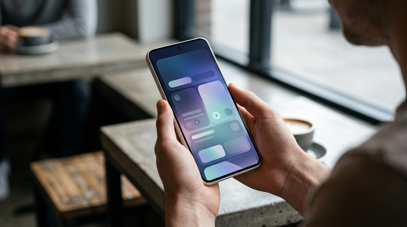
- The Gemini app redesign replaces the prompt window with a pill-shaped input, centred “Hi [name], what’s on your mind?” greeting, and a pulsating gradient background.
- The model picker moves to a top-left dropdown; a new plus button opens a bottom sheet for Photos, Camera, Files and Notebooks.
- Tools (Images, Videos, Music, Canvas, Deep research, Guided learning) are listed beneath uploads with descriptions, not buried behind menus.
- Rollout sequence: live on Gemini for Mac, limited rollout on iOS (heavy use of Liquid Glass), still being tested on Android and desktop web.
What the Gemini app redesign actually changes
The Gemini app redesign is not a logo swap. The homepage swaps a flat prompt window for a pill-shaped input box, centres a friendlier greeting under the Gemini spark icon, and runs a coloured gradient that pulses when you start typing. The model picker, previously buried, sits in the top-left as a dropdown. The plus button now opens a bottom sheet with a carousel for Photos, Camera, recent images and a row for Files, Notebooks and “More uploads”. The Tools list — Images, Videos, Music, Canvas, Deep research, Guided learning — appears below with short descriptions rather than icons you have to guess at.
For Android users the practical answer is: not yet. The Gemini app redesign is currently most visible on Gemini for Mac, with a limited iOS rollout that leans hard on Liquid Glass. Android and desktop web are in testing. That is unusual for Google, which normally ships Android-first; the order here suggests Google is treating iOS as a serious shopfront for Gemini at the same time it is reshaping how Gemini behaves on every Android phone.
Why the Gemini app redesign is bigger than a UI refresh
Most chat apps still feel like terminal windows with rounded corners. The Gemini app redesign is one of the first attempts by a major lab to make an AI app feel like a phone app: ambient gradient, friendly greeting, modal sheets for files and tools. That matters because chat is no longer the only interaction. Photos, Camera, Notebooks, Canvas and Deep research are now first-class entry points, not slash commands. The Plus-button bottom sheet is the clearest sign that Google sees Gemini as a hub, not a chatbot.
The other tell is the model picker. Pushing it into a clearly labelled top-left dropdown signals that Google expects users to pick between models the way they pick between Drive accounts. That is the same workflow we have been pushing in pieces like our Gemma 4 open weights analysis: on-device, cloud, mini, ultra. The Gemini app redesign tells you Google now expects users to know the difference and care.
Gemini app redesign vs the chat-window competition
| Interaction | Old Gemini app | Gemini app redesign |
|---|---|---|
| Homepage | Static prompt with quick-action chips | Pill prompt, centred greeting, pulsating gradient |
| Model selection | Hidden behind a menu | Top-left dropdown |
| Adding files | Inline attach button | Plus-button bottom sheet with Photos, Camera, Files and Notebooks |
| Tools (Canvas, Deep research, etc.) | Icon row, easy to miss | Labelled list with descriptions in the side drawer |
| Account switcher | Top of drawer | Bottom of drawer, with new “Temporary chat” button on top |
The pattern matches what we said about on-device AI being the real Gemini counter-attack: the cleaner the front-end, the more value users get from accelerators sitting behind it. The Gemini app redesign also brings a small but telling change for power users — “See thinking steps” moves into an overflow menu and appears as a bottom sheet, keeping the conversation view uncluttered without hiding the trace from people who want it.
What UK Gemini users should expect next
If you are on iPhone, keep an eye on Gemini app updates over the next two weeks. The Gemini app redesign is rolling out incrementally rather than as a flag-day update, so two users on the same iOS version can see different homepages. If you are on Mac, the new look is already live and worth opening, particularly if you tried Gemini once at launch and stopped using it. The model picker change alone makes Gemini for Mac feel less like a clone and more like a real desktop assistant.
If you are on Android, you should set expectations. Google is testing the redesign now, and the bigger Android-specific story is the Material 3 Expressive direction sitting around Gemini, not the chat surface itself. The Gemini app redesign matters as a leading indicator: when Google moves the model picker to a permanent dropdown, you can read that as the company committing to multiple models as a fact of life for the next year, in line with what we wrote in our piece on Gemini on every Android.
The real risk of the Gemini app redesign is overreach. Pulsating gradients and modal bottom sheets look great in screenshots and can quickly feel busy when you use Gemini 30 times a day. The team has put the right surfaces forward, but the production version on Android needs to default to calm. If Google keeps the gradient subtle and lets the new file and tools sheets do the heavy lifting, this is the most coherent Gemini front-end since the rebrand from Bard.
MTW verdict
The Gemini app redesign is a quiet but important step: Gemini is no longer just a chat window. If you stopped using the app, this is the rebuild that earns a second look. On iPhone, force-quit and reopen the app for a few days until the new homepage lands.
Buyer action
Where to buy or check next
Use this as the final check before ordering a phone, changing network or trusting a headline monthly price.


Reader discussion
Leave a comment
Comments are moderated. Keep it useful, accurate, and on topic.