News · 2 Aug 2011 · MTW Editorial Team

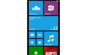
In case you’ve been living under a rock for the passed few weeks you may have already noticed that the Windows phone logo is now a square instead of a circle. This was obviously done to match the Metro tiles which will also be present in Windows 8 next year so one can expect another logo change in the near future when the desktop/Tablet OS finally ships. You will also note that this also confirms the Windows Phone branding I was talking about a while ago. It doesn’t matter if Mango is Windows Phone 7.5, or 7.1, the phone will be branded Windows Phone same for the Marketing etc.. Now the big question is; Will the marketing campaign be as poor as last years or are will finally going to see something worth the millions that are being spent?
source: MSDN
Buyer action
Where to buy or check next
Use this as the final check before ordering a phone, changing network or trusting a headline monthly price.